Data visualization tools are essential assets in transforming complex data into visually compelling formats that enhance understanding and decision-making. In today’s data-driven landscape, the ability to present information effectively can significantly influence outcomes in various fields, from marketing to scientific research. These tools not only simplify the analysis process but also provide unique features that cater to diverse visualization needs, making it vital for professionals to choose the right one.
As we delve deeper into the world of data visualization tools, we will explore their importance, popular options available, types of visualizations, best practices, and future trends that are shaping this dynamic industry. This comprehensive overview will empower you to harness the full potential of data visualization in your work.
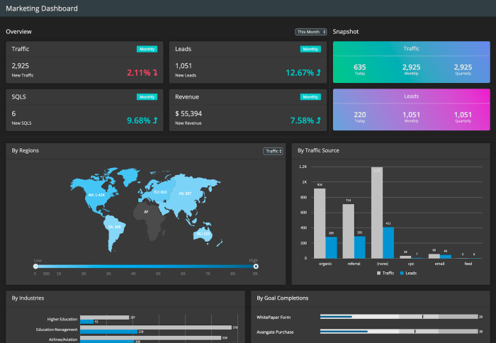
Overview of Data Visualization Tools
Data visualization tools play a crucial role in transforming complex datasets into understandable visual representations. In the realm of data analysis and presentation, these tools enhance the ability to spot trends, patterns, and insights that may not be immediately apparent in raw data. By leveraging visual elements, stakeholders can make informed decisions quickly and effectively.
Common features found in most data visualization tools include user-friendly interfaces, customizable templates, real-time data updating, and diverse visualization options such as charts, graphs, and maps. Additionally, many tools offer integration capabilities with other data sources, making it easier for users to consolidate and analyze their data efficiently. The market offers a variety of data visualization tools ranging from simple chart makers to advanced business intelligence platforms.
Popular Data Visualization Tools

There are numerous data visualization tools available that cater to different needs and budgets. Here are five popular options:
- Tableau: Renowned for its intuitive drag-and-drop interface, Tableau allows users to create visually appealing dashboards and reports. Its strength lies in handling large datasets and integration with multiple data sources.
- Power BI: A Microsoft product, Power BI is highly accessible for businesses already using Microsoft services. It offers robust analytics capabilities and seamless integration with other Microsoft tools.
- Google Data Studio: A free tool that provides customizable reports and dashboards, Google Data Studio is ideal for those looking for a cost-effective solution, particularly for users familiar with other Google applications.
- QlikView: Known for its associative data model, QlikView enables users to explore data from multiple angles, providing dynamic visualizations and real-time data analytics.
- Looker: This tool focuses on data exploration and business intelligence, offering powerful visualization options along with an integrated modeling layer that allows users to define metrics and data relationships.
The following table compares the pricing and accessibility of these tools:
| Tool | Pricing | Accessibility |
|---|---|---|
| Tableau | Starting at $70/month | Desktop and Cloud options |
| Power BI | Starting at $9.99/month | Desktop and Cloud options |
| Google Data Studio | Free | Web-based |
| QlikView | Contact for pricing | Desktop and Cloud options |
| Looker | Contact for pricing | Cloud-based |
Types of Data Visualizations
Various types of visualizations serve different purposes and can enhance the understanding of data. Some of the most common types include bar charts, line graphs, and heat maps. Each type has its specific strengths and is suited for different scenarios.
- Bar Charts: Effective for comparing quantities across categories. Best used when displaying discrete data, such as sales figures by product line.
- Line Graphs: Ideal for showing trends over time. They are commonly used in financial reports to depict revenue growth across several quarters.
- Heat Maps: Useful for illustrating data density or magnitude using color variations. Often used in geographical data analysis to represent population density across regions.
Choosing the Right Tool, Data visualization tools
Selecting the appropriate data visualization tool requires careful consideration of several factors. Key elements to evaluate include the type of data to visualize, user experience level, and integration capabilities with existing systems.
A checklist of features to consider when choosing a data visualization tool includes:
- User Interface: Is it intuitive and easy to navigate?
- Customization: Can you tailor visualizations to fit specific needs?
- Collaboration: Does the tool support sharing and collaborative work?
- Scalability: Can it handle growing amounts of data?
- Support: Is there reliable customer support available?
Audience needs significantly influence the selection of visualization tools. Below is a comparison of how different audience segments may require different features:
| Audience | Preferred Features |
|---|---|
| Data Analysts | Advanced analytics capabilities |
| Business Executives | Quick insights and high-level overviews |
| Marketers | Customization for campaigns and visual storytelling |
| Developers | Integration with other tools and APIs |
Best Practices for Data Visualization
Creating effective data visualizations requires adherence to specific techniques and principles. Some key practices include using appropriate color schemes, maintaining simplicity, and ensuring readability.
Common pitfalls to avoid when designing visualizations encompass:
- Overcomplicating designs with unnecessary elements.
- Using misleading scales or axes that distort data interpretation.
- Neglecting accessibility considerations such as color blindness.
Design principles to follow for clarity and impact include:
- Consistency in design elements across visualizations.
- Clear labeling and annotation for context.
- Effective use of whitespace to enhance focus on the data.
Case Studies

Several organizations have successfully implemented data visualization tools, resulting in enhanced decision-making and operational improvements. Below are a few notable case studies:
- Company A: Utilized Tableau to improve sales forecasting, leading to a 20% increase in accuracy.
- Company B: Leveraged Power BI for real-time analytics in their marketing campaigns, boosting ROI by 15%.
- Company C: Adopted Google Data Studio to visualize customer feedback, resulting in actionable insights that improved customer satisfaction ratings.
Key insights and lessons learned from these case studies include:
- The importance of user training for maximizing tool effectiveness.
- Regular updates and iterations on visualizations to keep data relevant.
- The value of integrating feedback from end-users for further refinements.
Future Trends in Data Visualization
The field of data visualization is continuously evolving, with emerging trends and technologies shaping its future landscape. Notable trends include increased use of artificial intelligence (AI) to enhance data analysis and visualization capabilities.
AI is impacting data visualization tools by automating data cleaning, suggesting optimal visualization types based on data characteristics, and even creating predictive models. Potential developments in the industry might involve enhanced interactivity in visualizations, making them more engaging and informative for users.
As organizations increasingly rely on data-driven decision-making, the demand for advanced visualization tools is expected to grow, driving innovation and further integration of AI technologies.
Resources and Learning

For those looking to enhance their skills in data visualization, numerous online courses and resources can provide valuable insights. Some recommended platforms include:
- Coursera: Offers courses on data visualization from top universities.
- Udacity: Provides a nanodegree program focused on data visualization.
- edX: Features various courses on data analysis and visualization.
Additionally, several books offer valuable insights into the principles and practices of data visualization. Notable mentions include:
- “The Visual Display of Quantitative Information” by Edward Tufte
- “Storytelling with Data” by Cole Nussbaumer Knaflic
Finally, community forums and groups can offer networking and support, such as:
- Data Visualization Society: A community for sharing resources and insights.
- Tableau Community Forum: A space to seek help and share knowledge related to Tableau.
Final Thoughts: Data Visualization Tools
In conclusion, data visualization tools are more than just software; they are pivotal in bridging the gap between raw data and actionable insights. By understanding the various tools and techniques at your disposal, as well as the emerging trends in the field, you can greatly enhance your ability to communicate data effectively. The journey to becoming proficient in data visualization is ongoing, and the right tools will undoubtedly guide you toward success in your analytical endeavors.