Visual BI dashboards are revolutionizing the way businesses interpret and engage with data, becoming essential tools for effective decision-making. These dynamic interfaces not only simplify complex data sets but also enhance the ability to make informed decisions quickly. By integrating various data sources and presenting them in a visually appealing format, visual BI dashboards facilitate a deeper understanding of key performance indicators and trends.
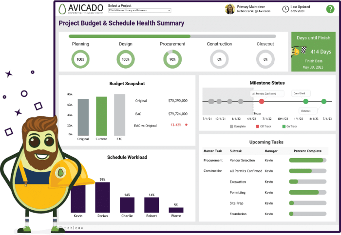
An effective visual BI dashboard typically includes components such as graphs, charts, and gauges, designed to deliver insights at a glance. Their significance in the realm of business intelligence cannot be overstated, as they empower organizations to visualize their data and drive strategic actions based on real-time information.
Introduction to Visual BI Dashboards
Visual BI dashboards are graphical representations of key business metrics and performance indicators, designed to provide a quick and comprehensive overview of an organization’s performance. Their primary purpose is to facilitate data visualization, enabling stakeholders to make informed decisions based on real-time information. The significance of visual representation in business intelligence lies in its ability to transform complex data into understandable visuals, allowing for quicker insights and enhanced communication within teams.
Typically, a visual BI dashboard comprises several components, including charts, graphs, tables, and indicators that collectively display critical data points. These elements work together to deliver a cohesive view of performance metrics, trends, and anomalies that are essential for effective business decision-making.
Types of Visual BI Dashboards
There are three distinct types of visual BI dashboards: operational, tactical, and strategic. Each type serves a specific purpose and caters to different aspects of business intelligence.
- Operational Dashboards: These dashboards provide real-time data and insights on day-to-day operations, ideal for monitoring immediate performance metrics. Industries such as manufacturing and customer service benefit significantly from operational dashboards, as they help track production rates, service levels, and customer interactions.
- Tactical Dashboards: Designed for mid-level management, tactical dashboards focus on short-term performance and strategic initiatives. For instance, marketing and sales teams use tactical dashboards to evaluate campaign performance and sales targets.
- Strategic Dashboards: These dashboards present long-term data insights, aiding top executives in assessing overall business performance and strategic planning. Industries like finance and healthcare utilize strategic dashboards for portfolio management and patient care analytics.
Key Features of Effective Visual BI Dashboards
An effective visual BI dashboard should incorporate several critical features to enhance user experience and data utility. These include interactivity, data integration, and real-time updates.
“Interactivity allows users to drill down into data visualizations, fostering a deeper understanding of trends and patterns.”
A comparison of various dashboard tools highlights their distinct features:
| Tool | Interactivity | Data Integration | Real-time Updates |
|---|---|---|---|
| Tableau | High | Multiple sources | Yes |
| Power BI | Moderate | Excel, SQL | Yes |
| Looker | High | Google Cloud | Yes |
User-friendly design and layout are paramount in BI dashboards, ensuring that viewers can easily navigate and interpret the data presented without confusion.
Designing Visual BI Dashboards

Creating an effective visual BI dashboard involves a systematic approach. The following step-by-step guide is essential for effective design:
- Define the objectives and key metrics to be displayed on the dashboard.
- Choose the appropriate visualizations that best represent the data, such as bar charts, line graphs, and pie charts.
- Organize the layout to prioritize the most critical information at the top.
- Incorporate interactive elements that allow for user engagement and exploration of data.
- Test the dashboard with actual users to refine usability and ensure clarity.
Utilizing design principles such as simplicity, consistency, and clarity can greatly enhance user experience and engagement. Color schemes should be chosen carefully to promote data comprehension, with contrasting colors highlighting key metrics while maintaining a professional aesthetic.
Tools for Creating Visual BI Dashboards
There is a wide variety of tools available for building visual BI dashboards, each with its strengths:
- Tableau: Known for its powerful visualization capabilities and ease of use.
- Microsoft Power BI: Offers great integration with Microsoft products and competitive pricing.
- QlikView: Renowned for its associative data model and in-memory processing.
- Looker: Provides strong data modeling and exploration features within Google Cloud.
These tools often include integration capabilities with existing data sources, ensuring seamless data flow for real-time analytics.
Best Practices for Visual BI Dashboards

Adhering to best practices in data representation and organization is essential for effective dashboard design. Key considerations include:
- Keep visualizations simple and focused on essential metrics to avoid overwhelming users.
- Ensure data accuracy and consistency by regularly updating and validating the data sources.
- Gather user feedback post-implementation to identify areas for improvement in design and functionality.
Case Studies on Visual BI Dashboards
Numerous businesses successfully implement visual BI dashboards, significantly impacting their decision-making and operational efficiency. For instance, a major retail chain utilized dashboards to track inventory levels in real-time, leading to optimized stock management and improved sales responsiveness. Another example involves a healthcare provider using dashboards for patient data analytics, which enhanced care delivery and operational workflows.
The lessons learned from these case studies emphasize the importance of tailoring dashboards to specific organizational needs and the broader implications for industry-wide data-driven decision-making.
Future Trends in Visual BI Dashboards
Emerging trends in visual BI dashboard technology and design are shaping the future of data analytics. The integration of AI and machine learning is enhancing dashboard functionality, enabling predictive analytics and automated insights generation. As user experience continues to evolve, dashboards are becoming more intuitive, incorporating advanced features such as natural language processing and augmented analytics.
The evolution of user experience will undoubtedly influence future dashboard designs, making them more accessible and aligned with user needs, ultimately improving organizational efficiency and responsiveness.
Last Word

In summary, the evolution of visual BI dashboards is paving the way for smarter business operations, enabling stakeholders to harness data in unprecedented ways. As we look toward the future, the integration of advanced technologies such as AI will elevate these tools even further, enhancing their functionality and user experience. Embracing these dashboards not only optimizes decision-making processes but also positions organizations to thrive in an increasingly data-driven landscape.